Book Spine Design Ideas
Once you've calculated the book spine width, it’s time to move to the design phase. We’ve put together a selection of popular book spine design ideas, from simple layouts to more detailed ones, to help inspire your project. A strong spine design can really catch the eye and increase the chances of a reader picking it up.
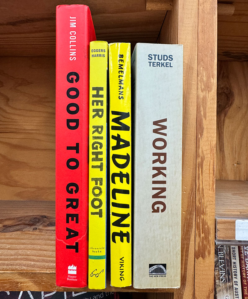
Pure Background with Large Text
This design feature with a solid background and big, bold text. It is great for books that need to grab attention right away. It often used in book with large book spine width. It works especially well for non-fiction books, like business, self-help, and biographies, where the title really needs to stand out. By keeping the design simple, the focus stays on the title, making it easy for readers to spot and remember the book on a crowded shelf.
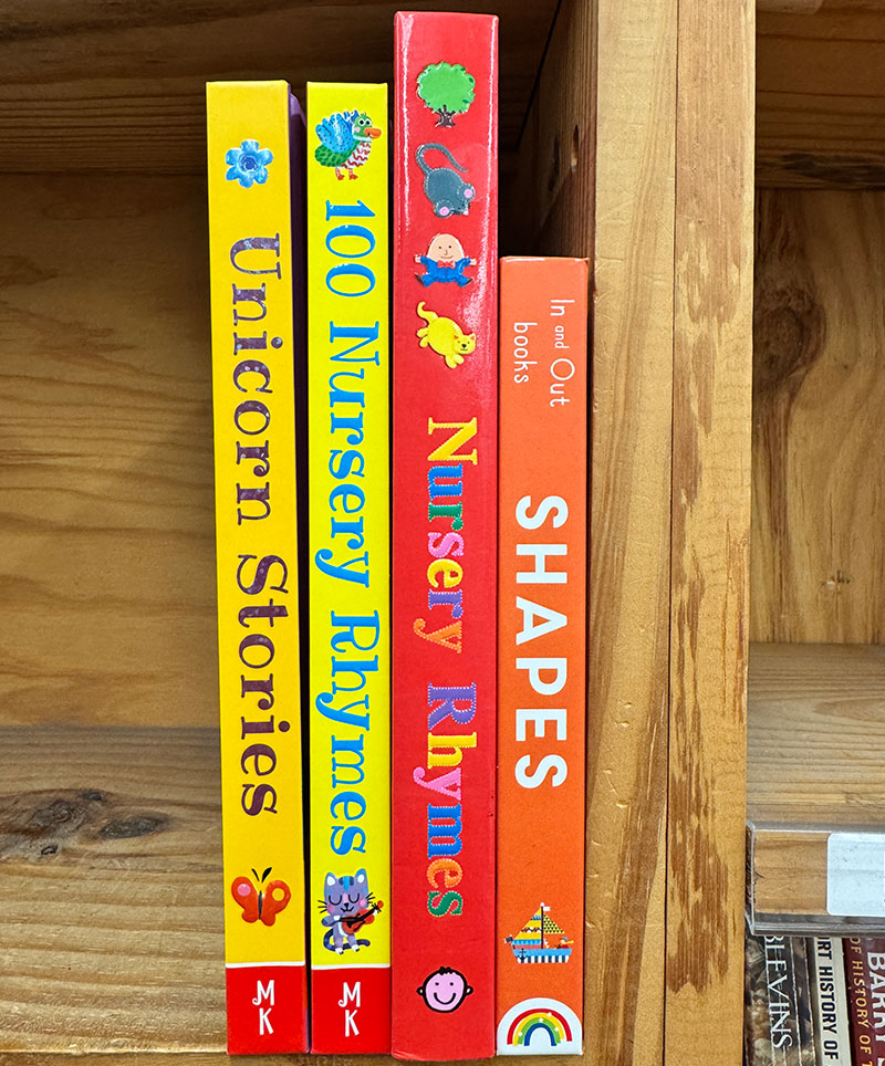
Pure Background with Decorative Text
This style, with a pure background and decorative text, is ideal for children's books. The colorful fonts and playful icons make each title inviting and visually engaging for young readers. This approach helps create a fun, approachable look that stands out on the shelf, drawing attention with bright colors and charming details that capture a child’s interest.
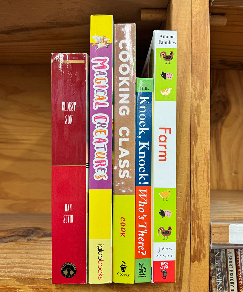
Sectional Design Layout
This sectional layout design divides the spine into different sections, often using varied colors, fonts, or icons for each part. This approach works well for playful or educational books, especially children’s titles, as it adds visual interest and can convey different themes or content elements. The sections make the spine engaging and eye-catching, helping the book stand out on the shelf.
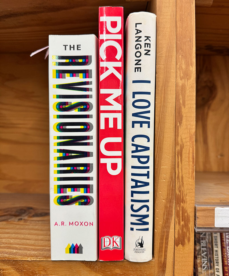
Eye Catching Design
These eye-catching book spine designs are bold and attention-grabbing, almost like they're shouting from the shelf. The use of large, blocky text and vibrant colors makes them hard to miss, instantly drawing the reader’s gaze. This style works well for books with strong messages or themes, making a confident statement that’s perfect for titles wanting to stand out in a crowded space.
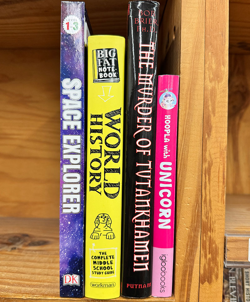
Font Matching Design
These book spine designs use fonts that really fit the vibe of each book. For example, the 'Space Explorer' has bold, playful letters that feel adventurous, while 'World History' uses a classic, scholarly font that feels serious. Each title's font style gives a little hint about what the book is about, making it easier to grab the right one off the shelf.
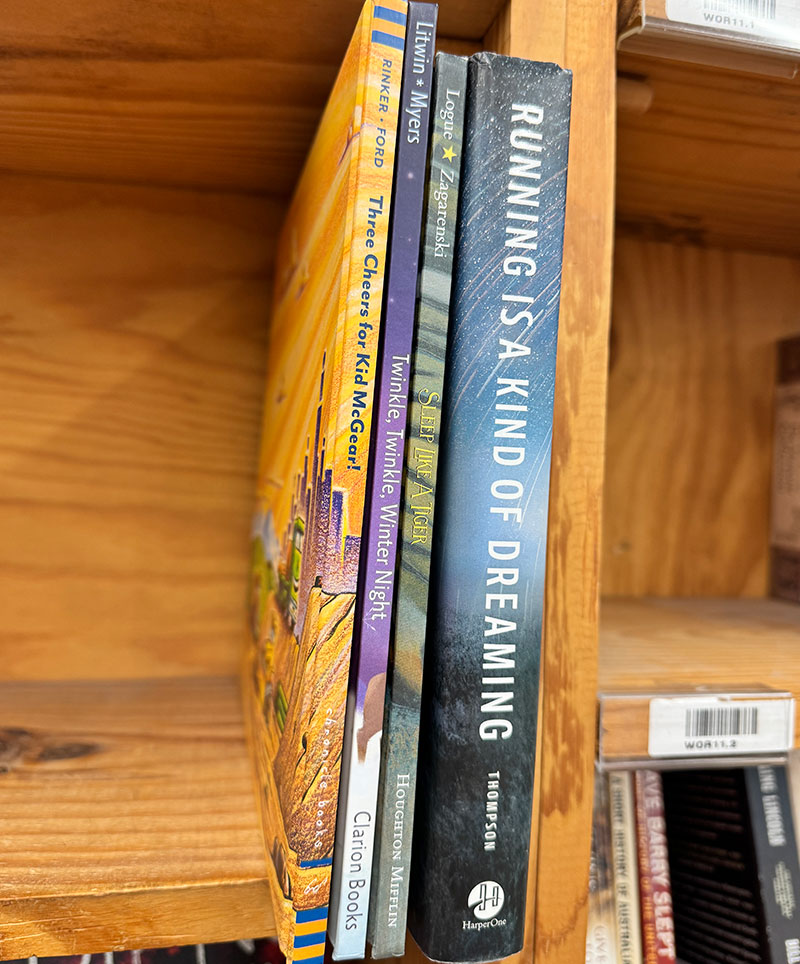
Continuous Graphic
These spines use a continuous graphic design, with artwork flowing across the spine from the front cover. This seamless look makes the book feel like a complete piece of art, adding visual interest and inviting readers in. It’s a great choice for storytelling or visually rich books.
Still need more ideas?
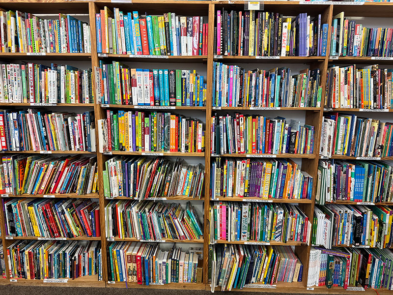
This is a look at a children's book section, filled with a variety of spine designs to inspire you further. From bold colors to playful fonts, this section shows the many ways books can stand out. If you'd like a closer look, click the link below to view the image in full resolution.

